blend it
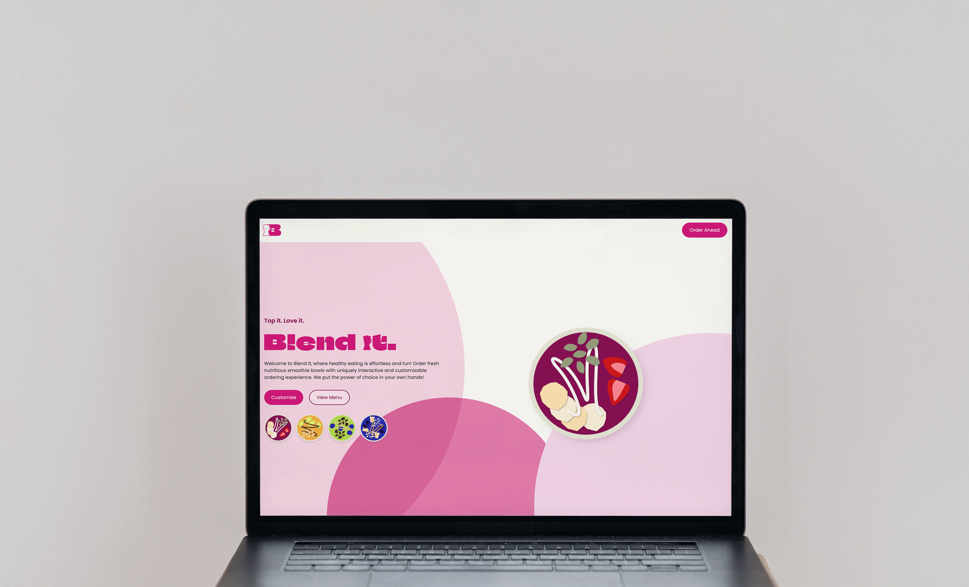
Using React.js and Tailwind CSS, our team wants to develop an online ordering with a uniquely interactive and fully customizable experience, empowering customers to create their perfect smoothie bowl blend.
Input
Masha Supikhanova – Web Developer
Total Hours
25
Tools
Figma - Branding and Prototype Development
React.js, Tailwind CSS, StepWizard - Technologies
Team
Paul Aries - Web Developer
Christian Yip - Web Developer
intro.
This is the first big project in React.js that me and my team have ever built. Paul, Christian and I found ourselves constantly inspired by each other's work and decided to unite our efforts and create Blend It. We were willing to dedicate our personal time to create something truly unique, you should see for yourself.
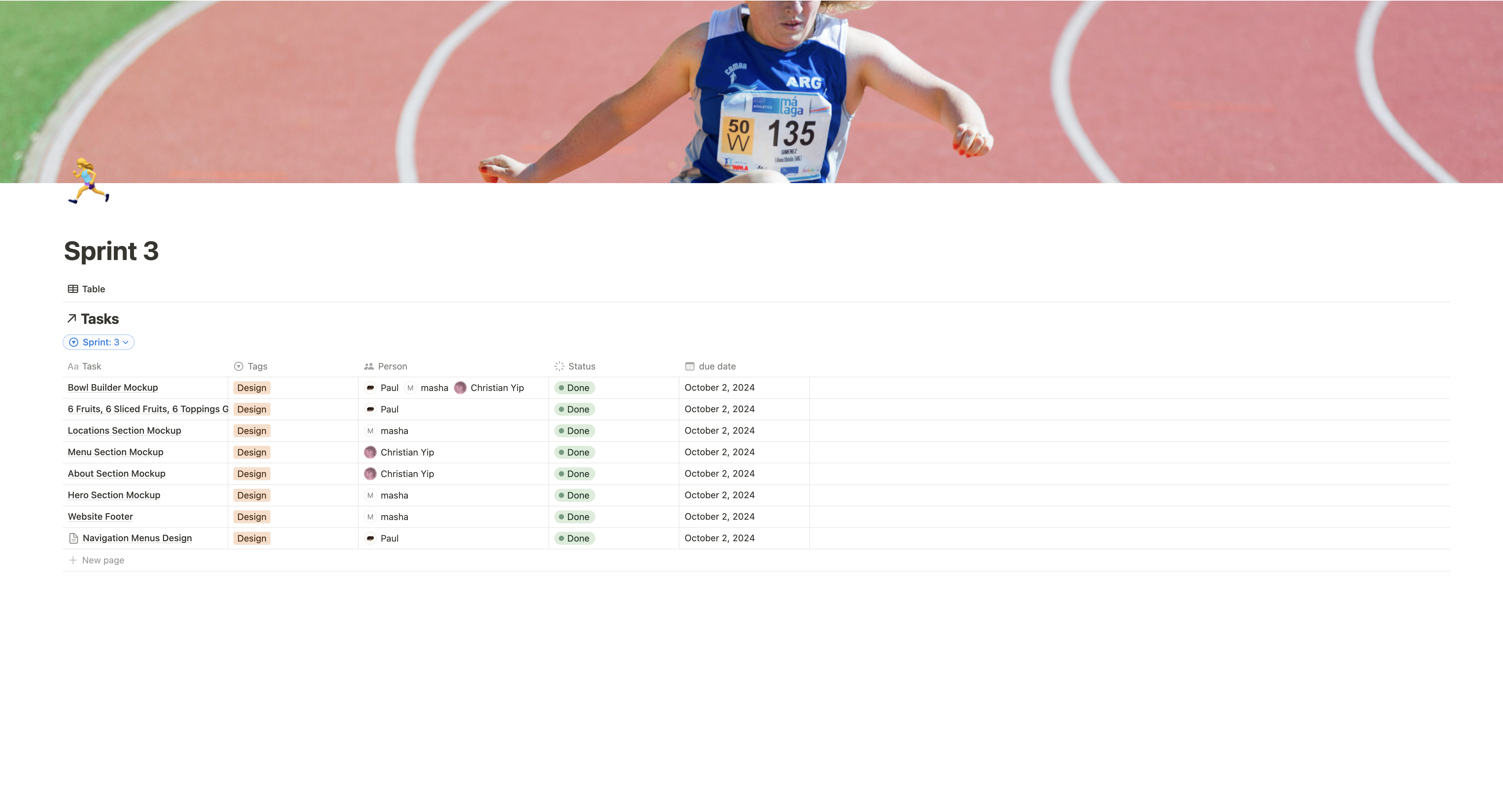
We approached the project with full collaboration with agile style aproach, ensuring the end result was executed to the best of our abilities while holding each other accountable. We used Notion as our project management platform—breaking down sprints, assigning tasks, defining deadlines and storing all resources in one place. When Discord served as our communication software of choice.
to start we held our first in-person meeting, where the name Blend it and the initial moodboards were born
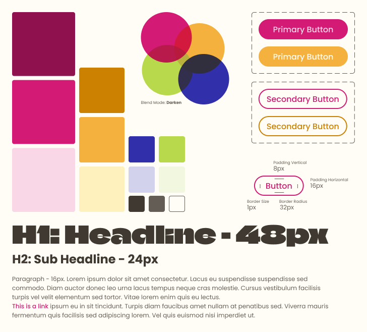
After that I started creating color palette and gathering imagery, while Paul took change of our logo and Christian went in depth about our brandʼs story. Together we collaborated on creating fruit graphics from vectors in Figma resulting 11 original items we started with.
With the colors, my goal was to convey boldness, freshness, and quality. They're not far from the original primary colors, which in my opinion works great when you're selling or promoting such natural and unprocessed products as fruit smoothies.
prototyping.
Website design began with wireframe creation. This approach allowed us to quickly transfer ideas from our heads onto Figma frames and iterate as needed. Once we agreed on the layout and functionality, we moved to the prototyping phase. The design started to gain colors, text copy, and interactions.
Our goal was to recreate as much functionality as the real website should have. This approach made our development process clear, seamless, and straightforward for every team member, regardless of which section they were working on.
development.
To kickstart development, we created a shared GitHub repository and set up individual branches for each team member to prevent code conflicts. Since we're using Tailwind CSS for styling, we also created a tailwind.config.js file to define our brand colors and fonts from the style tile, ensuring consistency throughout the project.
code snippets:
module.exports = {
    content: [
        "./src/**/*.{js,jsx,ts,tsx}",
    ],

    // The theme is where we can declare breakpoints, define fonts, add custom values, and create custom animations
    theme: {
        screens: {
            desktop: { 'min': '720px' },
            mobile: { 'max': '520px' },
        },
        extend: {
            fontFamily: {
                // Define your fonts here.
                climate: ['Climate Crisis', 'serif'],
                poppins: ['Poppins', 'sans-serif'],
            },
            animation: {
                // Define your animations here.
                shake: 'shake 1s ease-in-out infinite alternate',
                spin: 'spin 0.5s ease-in-out alternate',
                fade: 'fade 1s cubic-bezier( 0.175, 0.885, 0.32, 1.5 ) forwards',
            },
            keyframes: {
                // Create keyframe animations here.
                shake: {
                    '0%': { transform: 'rotateZ( 10deg )' },
                    '50%': { transform: 'rotateZ( -10deg )' },
                    '100%': { transform: 'rotateZ( 10deg )' },
                },
                spin: {
                    '0%': { transform: 'rotateY( 0deg )' },
                    '50%': { transform: 'rotateY( 90deg )' },
                    '100%': { transform: 'rotateY( 0deg )' },
                },
                fade: {
                    '0%': { transform: 'translateY( 125% )', opacity: '0' },
                    '100%': { transform: 'translateY( 0 )', opacity: '100%' },
                },
            },
        },
        colors: {
            transparent: 'transparent',
            white: '#ffffff',
            black: '#000000',
            background: '#FFFDF5',
            pink: {
                100: '#F9D7E7',
                500: '#D31A74',
                900: '#8F124E',
            },
            yellow: {
                100: '#FFF1BE',
                500: '#F4B13E',
                900: '#CC8100',
            },
            green: {
                100: '#F2F8E0',
                500: '#B8D94C',
                900: '#769A00',
            },
            blue: {
                100: '#D2D2ED',
                500: '#312FAA',
                900: '#313083',
            },
            grey: {
                100: '#FFFDF5',
                500: '#635D55',
                900: '#403931',
            },
        },
    },
    plugins: [
        // Animation Delay
        require("tailwindcss-animation-delay"),
    ],
}
This website was developed with a mobile-first approach. This is my first time doing so, and now I totally understand why it works. It prioritizes essential content and functionality for smaller screens, leading to a more focused user experience. Also, adding breakpoints from smaller to larger screens makes more sense and creates a much smoother process.
carousel.
Hero sction features a smoothie bowl carousel. Each bowl is placed along the circumference of an invisible circle using trigonometric calculations to determine its x and y coordinates. The bowls are evenly spaced by calculating an angle based on the total number of bowls, and each bowl is positioned with translate and rotate transforms to maintain alignment as the carousel rotates. The central background circle, which changes color based on the selected bowl, is absolutely centered with transforms to keep it responsive.
Each smoothie bowl has its own color scheme defined in an array of objects, with properties for background, fill, and text colors. When a bowl is selected, the selectedBowl state is updated, triggering a useEffect hook to apply the corresponding color scheme to the page so it matches the selcted bowl.
code snippets:
    // State variables for selected bowl and color scheme
    const [selectedBowl, setSelectedBowl] = useState(0);
    const bowls = [bowlPink, bowlYellow, bowlGreen, bowlBlue];

    // Color schemes for different bowls
    const colorSchemes = [
        { primary: 'bg-pink-500', secondary: 'fill-pink-100', text: 'text-pink-900', circle: 'fill-pink-500' },
        { primary: 'bg-yellow-500', secondary: 'fill-yellow-100', text: 'text-yellow-900', circle: 'fill-yellow-500' },
        { primary: 'bg-green-500', secondary: 'fill-green-100', text: 'text-green-900', circle: 'fill-green-500' },
        { primary: 'bg-blue-500', secondary: 'fill-blue-100', text: 'text-blue-900', circle: 'fill-blue-500' },
    ];

    const [colorScheme, setColorScheme] = useState(colorSchemes[0]);

    // Update the color scheme whenever the selected bowl changes
    useEffect(() => {
        setColorScheme(colorSchemes[selectedBowl]);
    }, [selectedBowl]);
    const SpinningBowlSelector = ({ selectedBowl, bowls, circleColor }) => {
        // Calculate the angle of each bowl in the circle
        const bowlCount = bowls.length;
        const angle = 360 / bowlCount;
        const radius = 400;

        return (
            <div className="
                relative
                mx-auto
                w-full h-full
                scale-1
                desktop:scale-150
            ">
                {/* Background circle */}
                <div
                    className="
                        absolute
                        top-1/2 left-1/2
                        transform -translate-x-1/2 -translate-y-1/2
                        transition-colors duration-300 mix-blend-multiply"
                    style={{
                        width: `${radius * 2}px`,
                        height: `${radius * 2}px`,
                    }}
                >
                    <svg viewBox="0 0 100 100" className="w-full h-full">
                        <circle cx="50" cy="50" r="50" className={`${circleColor} transition-colors duration-300`} />
                    </svg>
                </div>

                {/* Render the bowls */}
                <div
                    className="
                        w-full h-full
                        transition-transform duration-500 ease-in-out z-10"
                    style={{ transform: `rotate(${-selectedBowl * angle}deg)` }}
                >
                    {bowls.map((bowl, index) => {
                        // Calculate the angle of each bowl
                        const bowlAngle = index * angle;
                        // Calculate the x and y coordinates of each bowl
                        const x = Math.sin((bowlAngle * Math.PI) / 180) * radius;
                        const y = -Math.cos((bowlAngle * Math.PI) / 180) * radius;

                        return (
                            <div
                                key={index}
                                className="
                                    absolute top-1/2 left-1/2
                                    size-52
                                    transition-all duration-300"
                                style={{
                                    // Move the bowl to the correct position in the circle
                                    transform: `translate(-50%, -50%) translate(${x}px, ${y}px) rotate(${selectedBowl * angle}deg)`,
                                }}
                            >
                                {/* Render the bowl image */}
                                <img
                                    src={bowl}
                                    alt={`Smoothie Bowl ${index + 1}`}
                                    className={`
                                        w-full h-full
                                        object-cover
                                        rounded-full
                                        transition-all duration-300
                                        ${index === selectedBowl ? 'scale-125 shadow-lg' : 'scale-100'}
                                    `}
                                />
                            </div>
                        );
                    })}
                </div>
            </div>
        );
    };
bowl builder.
To start of the process I created a JSON file to serve as the data structure for a smoothie bowl builder process. The file contains a steps array for each step on the way, "Choose Your Base," "Add Your Fruits," "Choose Your Toppingsˮ, structured as an object with an id , a title , and an ingredients array. Each ingredient object includes id , name , icon , and image properties, where image provides a visual asset that can be animated onto the bowl once selected. This step streamlined the process for managing and updating bowl components, allowing us to add or modify ingredients without changing the core code or hard-coding options into each component. Next, I passed the file to the team who will use it to implement step-by-step functionality through a step wizard and style sections.
code snippets:
    export const smoothieData = {
        steps: [
            {
                id: 'base',
                title: 'Choose Your Base',
                ingredients: [
                    {
                        id: 'blueberry-base',
                        name: 'Blueberry',
                        image: BlueberryImage,
                        rgb: [75, 0, 130]
                    },
                    ...
                ],
            },
            {
                id: 'fruit',
                title: 'Add Your Fruits',
                ingredients: [
                    {
                        id: 'banana-sliced',
                        name: 'Banana Slices',
                        image: BananaSlicedImage,
                        layoutImage: BananaSlicedLayoutImage
                    },
                    ...
                ],
            },
            {
                id: 'topping',
                title: 'Choose Your Toppings',
                ingredients: [
                    {
                        id: 'cacao-nibs',
                        name: 'Cacao Nibs',
                        image: CacaoNibsImage
                    },
                    ...
                ],
            },
        ]
    };
overall it sparked my creativity and made me eager to collaborate more in my next projects
Canʼt discredit good time management, constant communication and effective project managment workflow that helped us stay on track and achive wonderfull results as well.
Blend it wasnʼt just a new development experience for me, learning React.js and Tailwind CSS, it was an exellent example how a good team can help you grow tramendously and make it fun in the process. We werenʼt afraid to try new things and take risks, thatʼs why the result is so rewarding! Canʼt discredit good time managment, constant communication and effective project managment workflow that helped us stay on track and achive wonderfull results as well.
more work.
-
the blue - water website
-
meowdy! Cat surprise boxes
-
workflow - promotional landing
-
the blue - water website
-
meowdy! Cat surprise boxes
-
workflow - promotional landing